DS-201d · Module 2
Exercise: Production Code from ChatGPT
5 min read
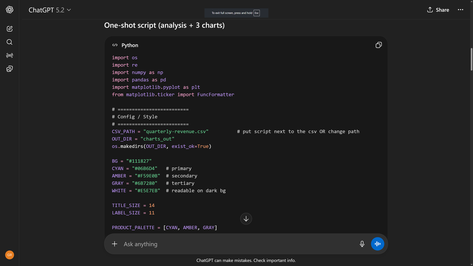
Open ChatGPT (chatgpt.com) and start a new conversation. Upload the quarterly-revenue.csv file using the paperclip icon. Now give it the same visualization request you gave Claude. What you get back is fundamentally different — not a rendered chart, but a Python script.
I uploaded quarterly revenue data. Create a complete analysis and visualization script.

Analysis: Identify the top product by revenue, fastest grower in % terms, regional differences, and any anomalies.

Then generate a Python script (matplotlib) that produces three charts:

Chart 1: Grouped bar chart — revenue by product per quarter (Q1-Q4 on x-axis, three bars per quarter). Show which product dominates and how they trend.

Chart 2: Small multiples — one line chart per product, with three lines each (one per region). This reveals whether growth is global or regional.

Chart 3: Stacked bar showing revenue composition by region for each quarter (all products combined).

Style: Dark background (#111827), cyan (#06B6D4) for primary data, amber (#F59E0B) for secondary, gray (#6B7280) for tertiary. Clean sans-serif font, 14pt titles, data labels on Q4 bars only. Save all charts as PNG files at 200 DPI.
ChatGPT will respond with a Python script — not a rendered chart. Here is what that looks like:
To see the actual charts, you need to: (1) copy the script, (2) save it as a .py file alongside your CSV, (3) make sure Python 3 is installed with pandas, matplotlib, and numpy, and (4) run the script. The charts are saved as PNG files in an output directory. This is more steps than Claude, but you get something Claude does not give you — a reusable script you own.
Here is what the Python script produces when you run it. These three charts were generated by the exact ChatGPT-produced code shown above:
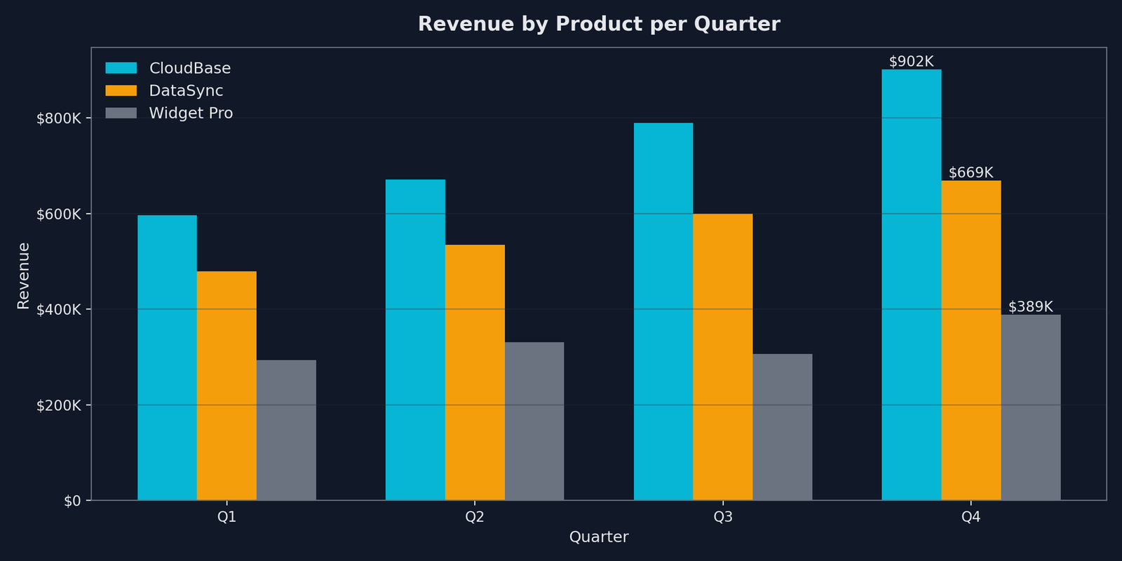
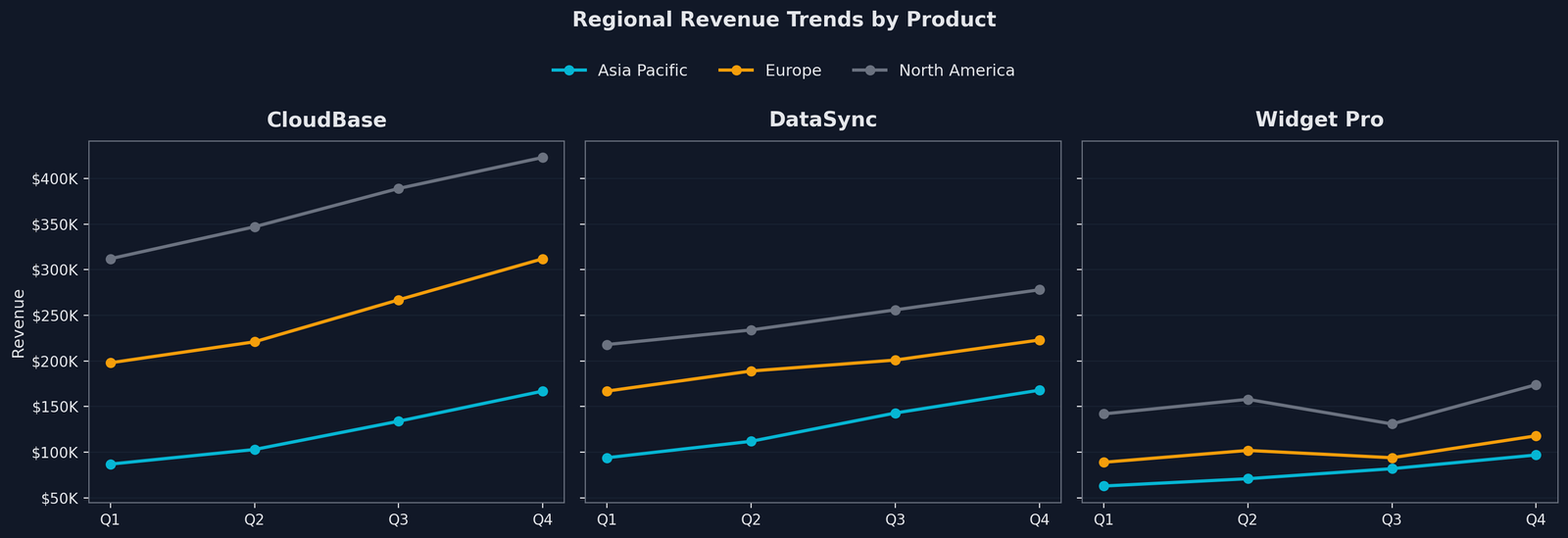
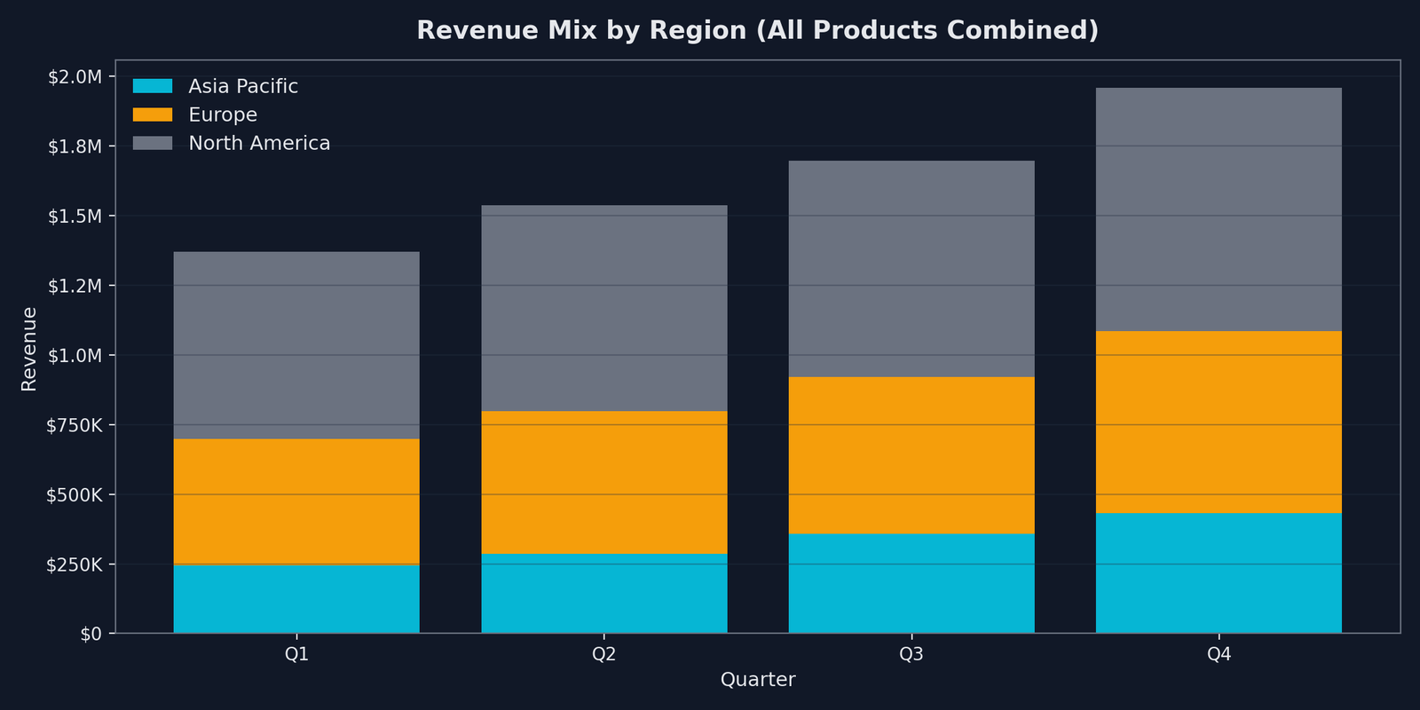
The charts are production-quality — dark theme, correct colors, clean labels, proper formatting. But getting here required an IDE, a Python environment, and manual execution. The tradeoff is clear: more effort to see results, but the output is a script you can version-control, schedule to run nightly, or integrate into a Jupyter notebook.
Do This
- Save the ChatGPT script to your codebase — it is a reusable asset, not a one-time output
- Iterate on the code by asking ChatGPT to modify specific sections — "change the bar width" or "add a fourth chart"
- Use the script as a template for future datasets — swap the CSV path and column names
Avoid This
- Expect ChatGPT to render charts in-browser — it generates code, not visuals
- Debug the script blindly — if it fails, paste the error back to ChatGPT and ask for a fix
- Rewrite the script from scratch for each dataset — modify the working script instead