DS-201d · Module 2
Exercise: Instant Dashboards in Claude
5 min read
Open Claude (claude.ai) and start a new conversation. Attach the quarterly-revenue.csv file and use the prompt below. What happens next is the key difference between Claude and ChatGPT — Claude does not hand you code to run. It generates a fully rendered, interactive Artifact that appears in a panel alongside the conversation. Analysis, charts, and a styled dashboard — all in one response, all visible immediately.
I've attached quarterly revenue data for a SaaS company. Analyze the data first, then create a visual dashboard as an Artifact.
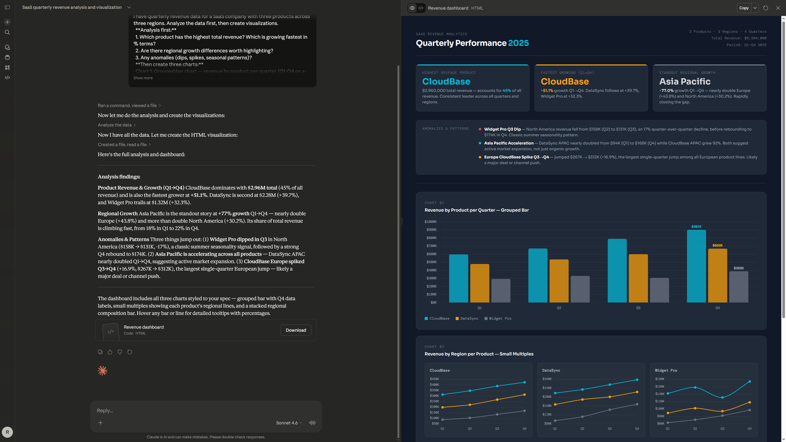
**Analysis:**
1. Which product has the highest absolute revenue? Which is growing fastest in percentage terms?
2. Are there regional differences in growth patterns?
3. What is the average revenue per unit for each product, and is it changing over time?
4. Are there any anomalies or patterns I should investigate?
**Dashboard (render as an Artifact):**
- Title section: "Quarterly Performance 2025" with KPI summary cards
- Chart 1: Grouped bar chart — revenue by product per quarter
- Chart 2: Small multiples — one line chart per product showing regional trends
- Include a data table with key metrics
**Style:** Dark background (#111827), cyan (#06B6D4) primary, amber (#F59E0B) secondary, gray (#6B7280) tertiary. Clean sans-serif font, 14pt titles. Presentation-ready.Claude will respond with two things simultaneously: a written analysis in the conversation (identifying CloudBase dominance, DataSync consistency, Asia Pacific growth trends, Widget Pro Q3 dip) and a rendered Artifact panel on the right side of the screen containing the full dashboard. Here is what that looks like:
Notice what happened. One prompt. One response. A complete dashboard with KPI cards, a grouped bar chart, small multiples with regional breakdowns — all rendered and interactive in the browser. You can screenshot it, iterate on it with follow-up prompts ("make the bars wider," "add a trend line"), or ask Claude to modify the analysis. The entire cycle from data to dashboard took seconds, not minutes.
Do This
- Ask Claude to generate dashboards as Artifacts for immediate visual feedback
- Use the three-step pattern: analyze first, then render, then iterate
- Screenshot the Artifact for presentations — or ask Claude to refine it further
Avoid This
- Ask Claude to "write Python code" for charts — you lose the Artifact advantage
- Skip the analysis step — the charts will be technically correct but analytically shallow
- Accept the first render without iterating — one follow-up prompt usually improves it significantly